
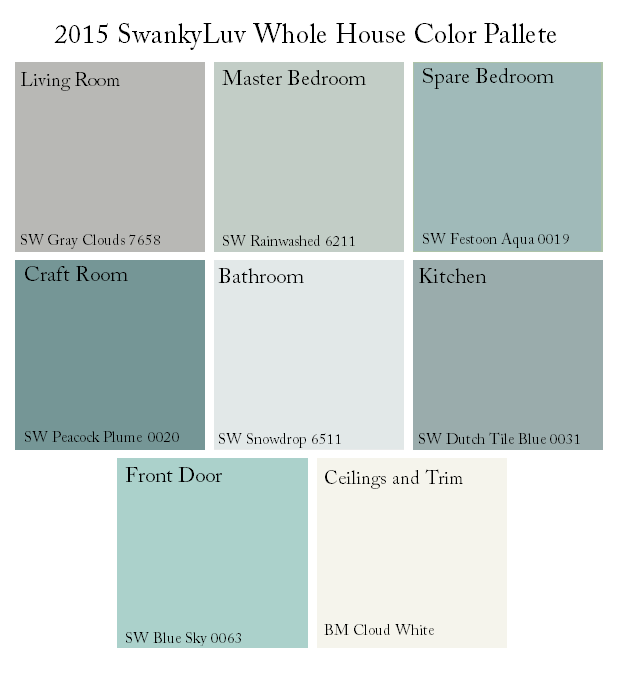
A few days before closing, we headed over to Lowes to buy doorknobs and get some paint swatches so we could get an idea of our color scheme before closing, and all we could find in paint swatches in the HGTV Sherwin Williams colors, which are great, but I could only find one of the colors (plus, the name and number were at the bottom of the swatch and impossible to see which made it super frustrating). We decided to head over to the Sherwin Williams store because we knew they would have a bigger assortment of swatches and I might have better luck finding the colors that I’d chosen.
When we got there, we ended up changing the whole thing. After pulling swatches for Grassland and Cascade Green, then finding a book with Blue Peacock in it, I realized that we had way too much green and not nearly enough blue. After pulling a few more swatches, we ended up with this, which I like a whole lot better:
And here’s how it looks on the floorplan:
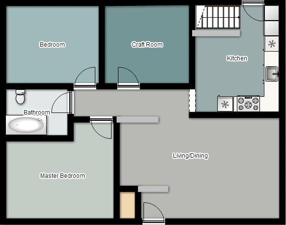
The colors look closer on the computer than they read in real life. They’re all bluish-greenish colors, which I love, and the color scheme keep it cohesive throughout the house, which is the most important part. Now, the trick is to get it all on the walls!
So, tell me what you think. Is it better than the last one?


5 comments
Skip to comment form
I love the combination, and have used similar colors myself, however due to the lighting in my house, anything I try seems to look gray once it’s up on a wall. Seriously! Any suggestions?
Author
Two, actually! You could pick a color that’s a little more blue or green than it is gray, which would help the colors pop a bit, or more add more lighting! Lamps, brighter lightbulbs, or even just a warmer shade of light would make the colors look different.
I’m having my kit’chen cabinets painted light gray-which are an old maple color -‘haven’t decided what shade yet. I’m struggling with what color forv he walls .What would be a good color to go with gray. I had wallpaper up but wanting to lighten up kitchen.
Author
I’d probably go with white walls, just to make sure those kitchen cabinets pop! Good luck!
I’m redoing my mom’s house since I’ve moved on with her to take care of her… It was built in 1925… It’s a slow process… I recently painted the dining room with Sherwin Williams Agreeable Gray… It was a country blue and their paint is so thick that I had no problem covering it up… Ripped out the old carpet to reveal beautiful wood floors… The only other room I’ve completed is the main bathroom… Under the old old wallpaper is tounge and groove boards commonly called shiplap… Removed the tub and replaced with a shower… I’m really enjoying This Old House but a long way to go… Linda… The lighting is very bright in this house because it still has the old awnings over the windows which I will keep… I would recommend Agreeable Gray… It has only a faint Gray tint to it… I didn’t like the blue tone grays… I will add pops of color with accents…